One of the hardest things about designing a marketing or content strategy is working out where to focus your efforts. There are countless good ideas to be found after a few simple searches online, but only a few hours in each working day.
But a good idea isn’t a universal solution. You don’t sell financial advice in the same way as accountancy services. And you don’t sell either of them the same way you sell crisps, or shoes, or cars, or yoga classes, or…
Fortunately, you can also find data – like HubSpot’s exhaustive report – and when it comes to content strategies, data is your best friend. With data, you can help identify effective tactics, appropriate for your business.
Boon or boondoggle?
It’s not hard to imagine glorious failures in marketing: spending too much money on slick video production that no one watches; large advertising campaigns on Facebook when your customers are all on Twitter; sophisticated, daily email marketing to a list of the wrong people. It’s enough to make any business wary of trying new things.
The solution to these issues is always research and planning. Taking the time to learn who your audience is, where they are and what they interact with is essential. Because once you know that, you can focus your efforts on just what they’re after.
Most importantly, it will let you experiment with new ideas with confidence.
A thousand words, in a tweet
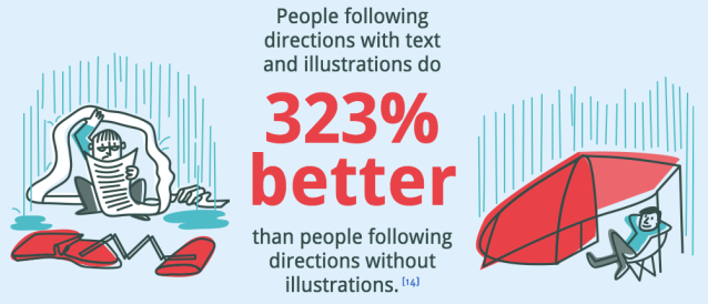
The effectiveness of imagery in online marketing is well established. The HubSpot report shows tweets with images get 150% more retweets, Facebook posts with images get 2.3 times more engagement and articles with an image every 75-100 words get double the social media shares compared to articles with fewer images.
But of course, one size doesn’t it all, and we operate in a sector led by data, figures and complex information.
One particularly powerful option is the infographic. HubSpot’s article suggests infographics can lead to a 12% increase in web traffic, encourage longer reading time and help people understand complex ideas more effectively. When you’re talking about financial information, these are essential metrics.
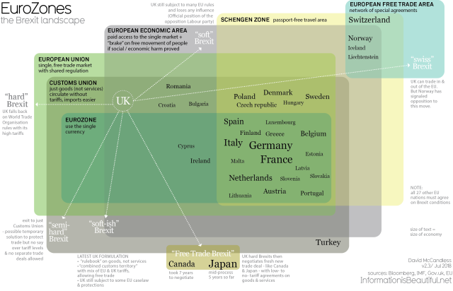
Fortunately we don’t have to do anything as difficult as explain what Brexit will actually mean. But, for example, it is likely we will have to help people understand changes to the inheritance tax system, in the very near future.
With a little imagination, it’s possible to present event the most fraught of topics in an easy-to-understand fashion. Because, in the social age, you need to be able to hook someone’s attention in a few seconds, even if your message is ‘Tax, tax, tax’!
The good news is, with a clear understanding of who you want to reach, and how you want to reach them, you could stand out from the competition and give your client communications new life.

